
CASE STUDY ● PRINT & DIGITAL DESIGN
A polished look for a firm that already has confidence
Avera & Smith had the logo and the voice. I gave them a look that works from screen to the side of the road.
Client
Avera & Smith, via Red Rocket Studios
My Role
Visual design
Deliverables
Website, billboards, bus wrap
THE STARTING POINT
From a video to a visual system
The GOAT message and logo started with a video and quickly became its brand. My role was to design the visual side and to create a cohesive system of color, type and lighting that looks great both on a homepage and on a bus.
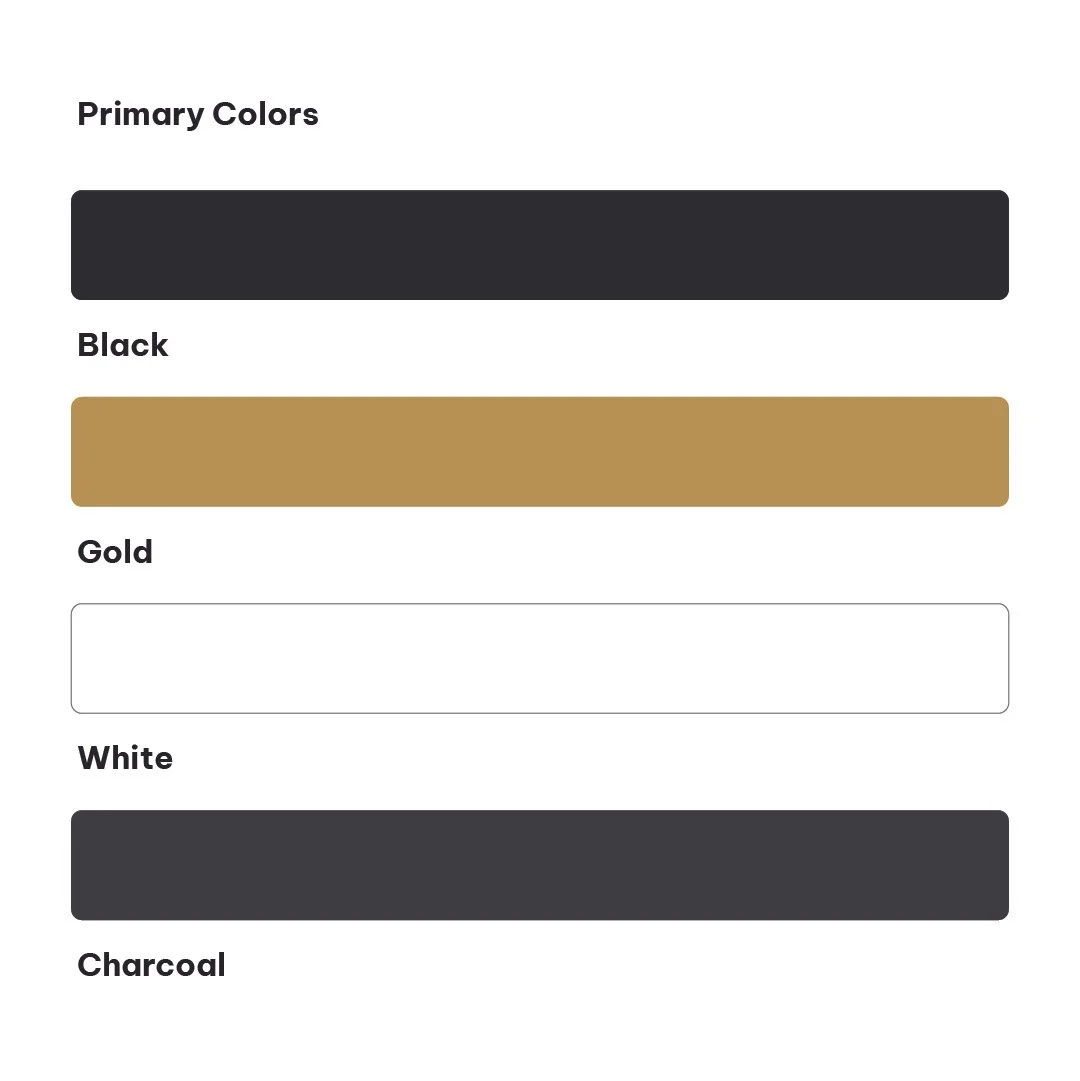
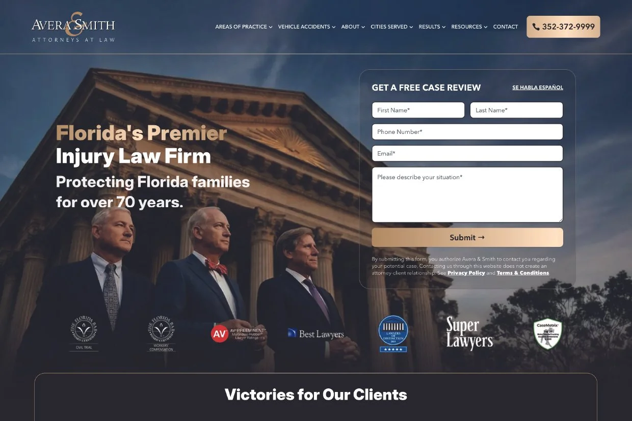
Color - Black and gold, with white for contrast.
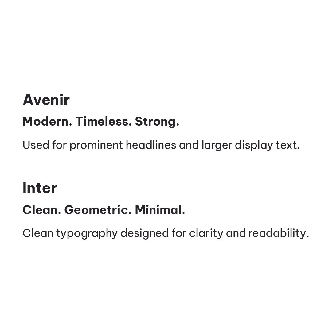
Type - Avenir for headlines, Inter for body text on the website.
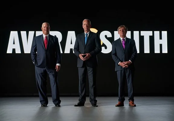
Photography - Provided by the RRS, lit and cropped to fit each format.
THE WEBSITE
Everything a worried visitor needs
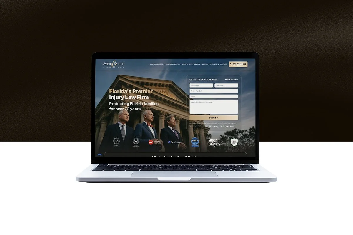
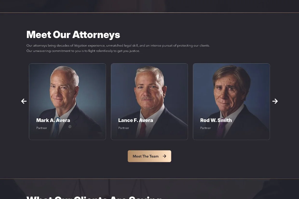
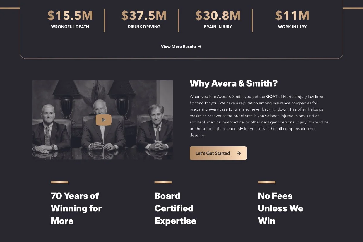
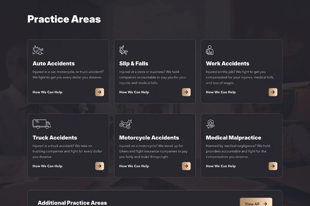
The top of the page puts the attorneys and the free case review form side by side. Everything below builds trust and keeps the next step in view.
THE CAMPAIGN
From screen to a moving bus
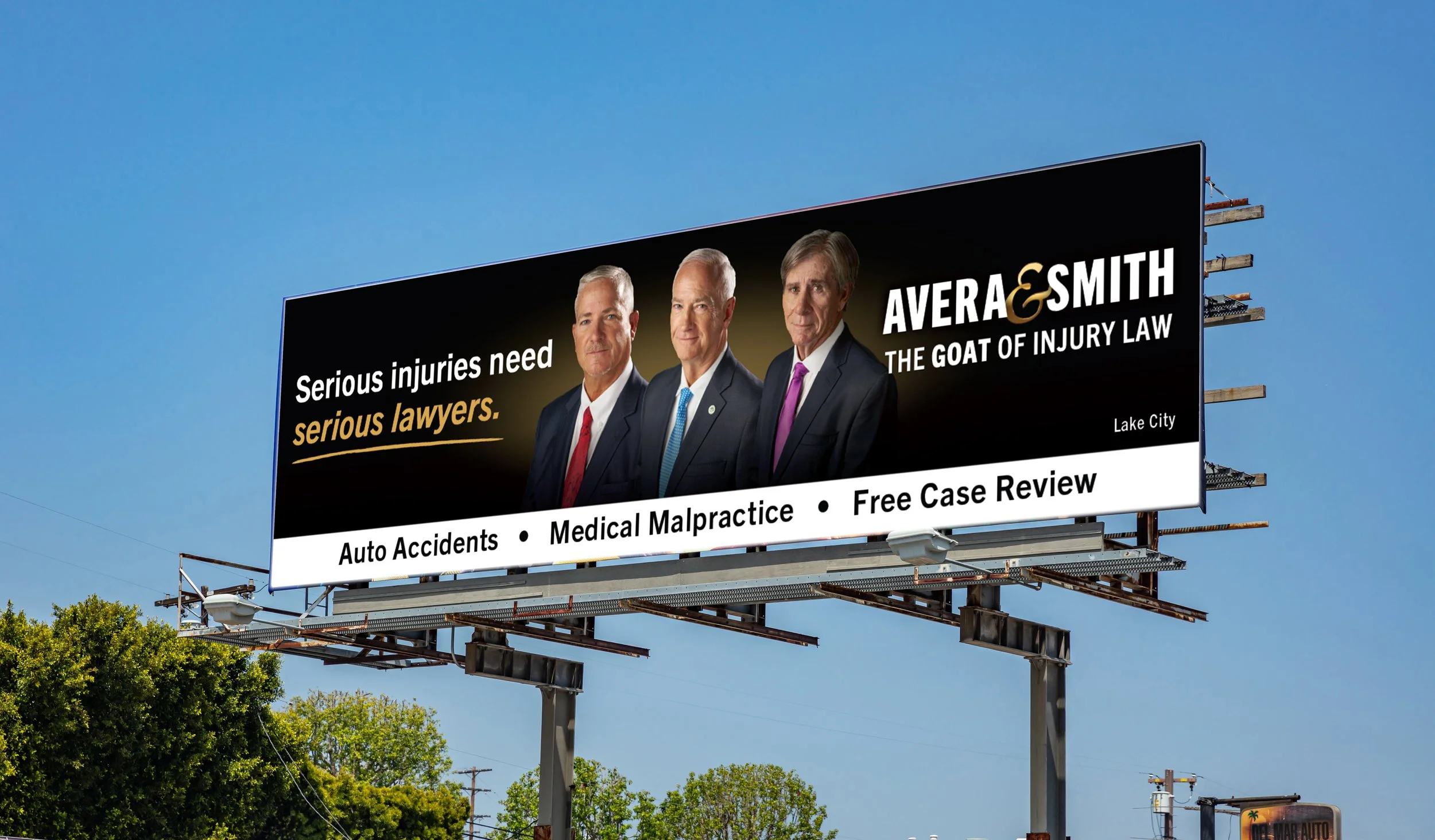
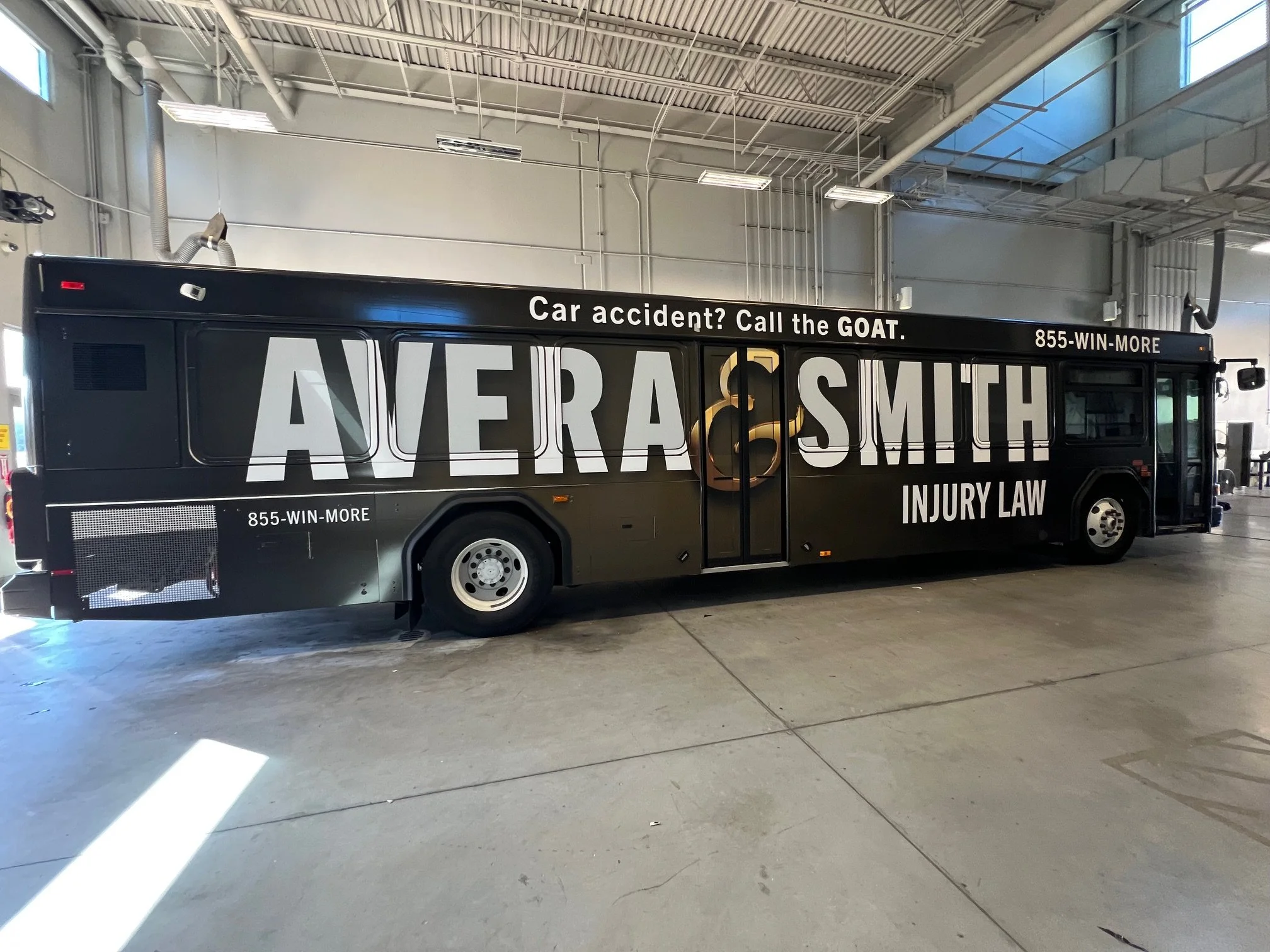
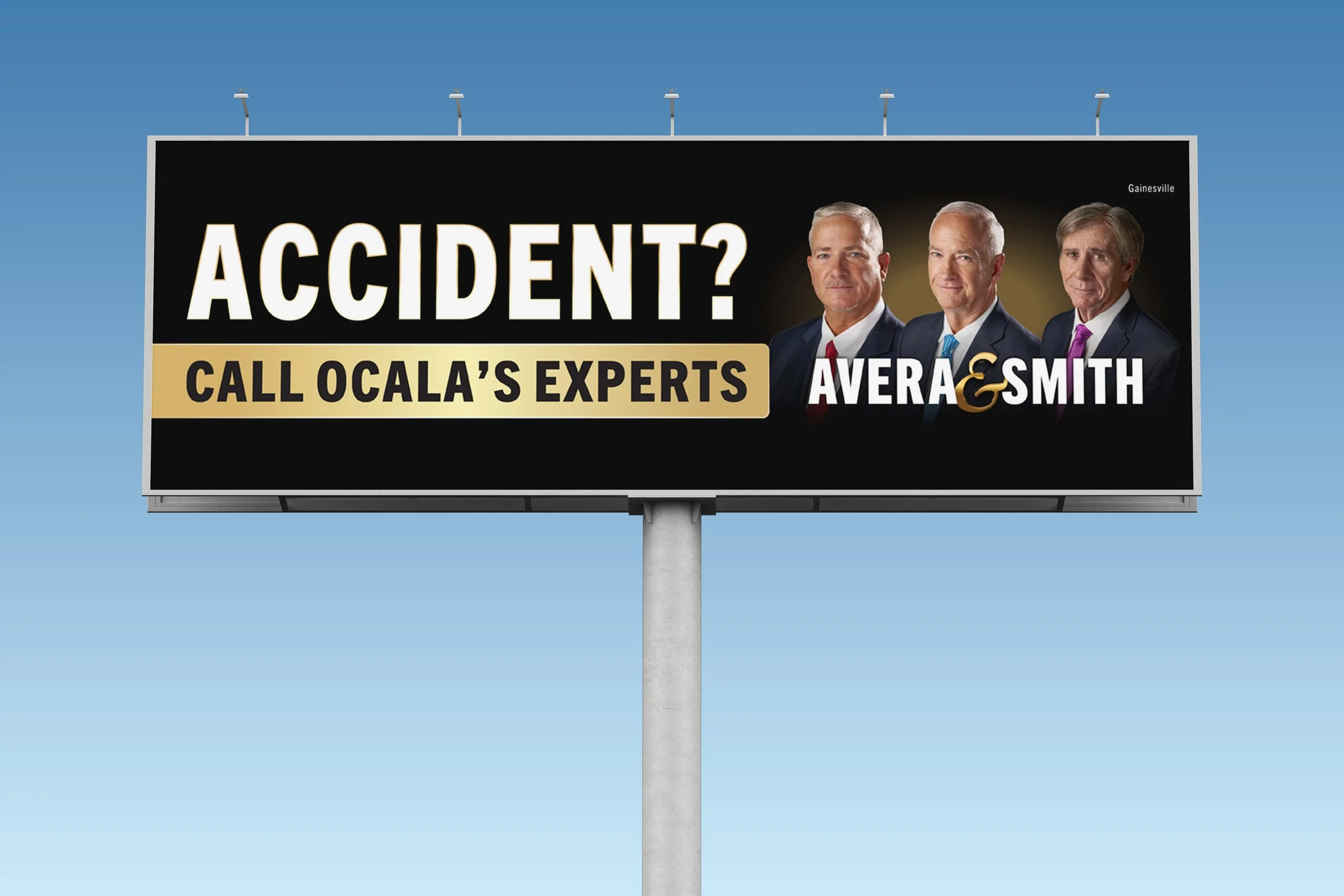
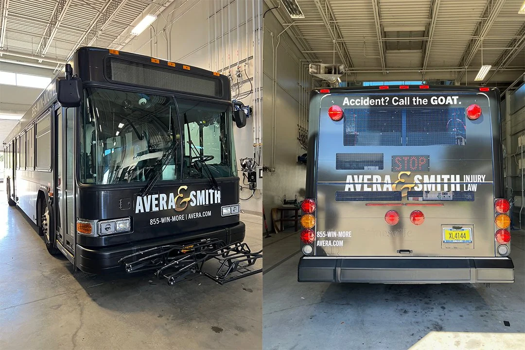
Each format got its own layout: a wide banner for the billboards, and a full-length wordmark for the bus, placed around windows and doors. The black, gold and warm lighting tie them together.
Next Case Study:
Back to all work